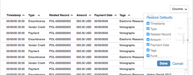
This reminds me of a couple other programs I work with. I think it’s a really valuable tool since each person using a table may be using it in a slightly different way or consider different data elements to be more or less important.
In SalesForce, when building a report, you can pick which data elements you want to show in a tabular report and which order for the columns to display in. You pick data elements mainly by clicking a toggle for the various elements within a list of data elements. You resequence the columns by clicking and dragging the column headers, so that the columns shift around on the screen. For reports, it can get more complicated than that, by adding calculated columns or coloring or such. That part is not so much display functionality though; that’s report functionality.
Another similar example is customizing the view of the main e-mail window in Outlook. Not sure how to add a screenshot in Discuss, but I’ll try to figure it out.
In the meantime:
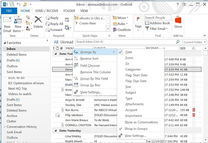
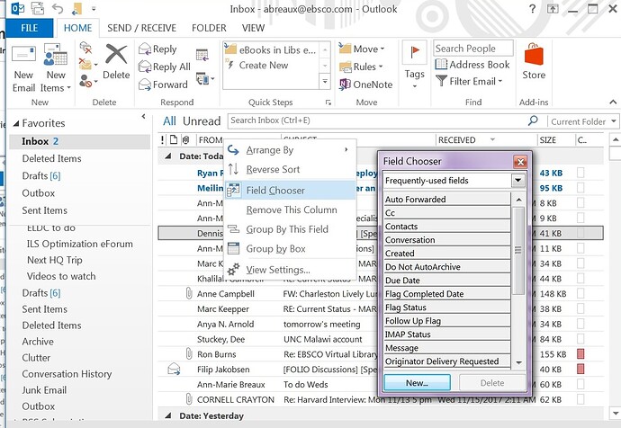
When you right click on the column headers:
Arrange by: lets you sort and group by any of the columns
Field Sorter: lets you add columns (data elements) from a list of possible data elements
Then once you’ve added the column, you can click and drag the columns to rearrange the order on your screen.
Delete columns
Etc.
The main point is that the data is all still there underneath. The column/display function is just changing which ones show or not, and how the rows within the columns are sorted or grouped.


