Discuss.FOLIO.org is no longer used. This is a static snapshot of the website as of February 14, 2023.

:pencil2: UX sketches: :desktop_computer: :left_right_arrow: :computer: :left_right_arrow: :iphone: “Responsive” tables

filipjakobsen
11 Dec '17

Since the inception of the visual language and UI framework for FOLIO, we have been wanting to build FOLIO as a system for the present and the future. That means supporting usage with various input devices, on various device and screen sizes, browser window sizes and browser zoom levels.

Library software contains a lot of data. And a lot of tables. Tables are inherently hard to scale down if one wants to maintain their large-size layout. However we believe it is important to be able to intuitively access the data in the FOLIO system no matter what size device, browser window or browser zoom level you use. The solution is the “reflow” the content in the table to be optimal and intuitive to use on a narrower layout.

We are nearing the point in time when we will want to support this “responsiveness” in tables, and we have looked into a few different patterns we could use.

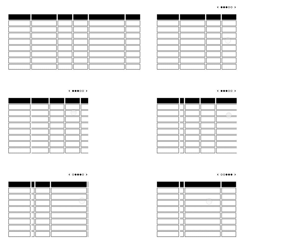
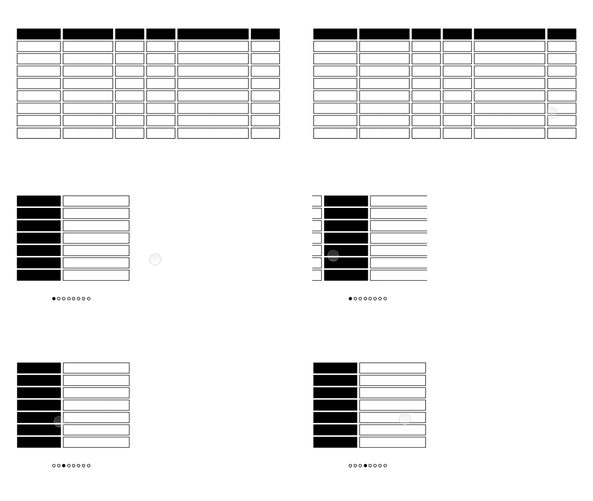
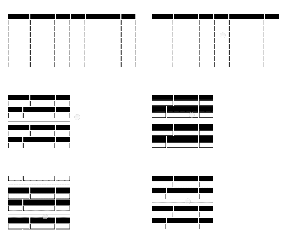
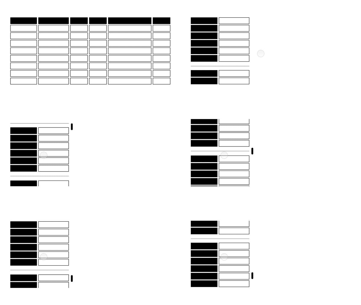
They are attached here below as animated GIFs. Have a look and share your thoughts, ideas and advice about which of these patterns might be preferable for your workflows in general, or for certain workflows:


Exploration 1 :point_down:

ResponsiveTable1


Exploration 2 :point_down:

ResponsiveTable2


Exploration 3 :point_down:

ResponsiveTable3


Exploration 4 :point_down:

ResponsiveTable4


Exploration 5 :point_down:

ResponsiveTable5


Animations by Benny Aarup

kmarti
14 Dec '17

Personally, I like Exploration 1. It reminds me of Excel’s freeze panes option. I’m not sure I followed what happened with Explorations 4 and 5. It looks like some of the data that was horizontal moved to vertical, but I don’t understand exactly how.

Ann-Marie
14 Dec '17

1 and 3 seem like they make the most sense to me. 3 feels like easy swiping to the left, the way so much happens on mobile phones.

2 and 4 - not so much

5 - could be OK, maybe, so long as there was clear delineation between different rows. Stacking up the data could make it harder to compare one row to another, or could mean more scrolling is required.

filipjakobsen
19 Dec '17

Thanks for your comments!

Exploration 4 and 5 turns the “table” layout into a “list” layout and will make the “sort by”, “show/hide columns”, etc. available in a dropdown instead of by clicking on the table headers.

The explorations above were made primarily for us as designers to assess different approaches, and I figured it would make sense to share them here as well. A premise for interpreting these is that when the elements are zoomed a lot, or when the window or screen is narrow, the table layout will in general probably not be manageable to use. Hence the switching to a list layout as shown in exploration 3, 4 and 5.

Even on larger screens, depending on how many column the end user chooses to view in the table, the table might need more horizontal space than is available. For these cases, one might switch to a list layout, or introduce a flexibility akin to what is shown in e.g. exploration 1.

filipjakobsen
19 Dec '17

On 5, yes, it would definitely not be a good view for comparing lists — however on the window size / zoom level / screen size it would be used, it would probably be hard to view multiple items at a time anyway. In that sense, exploration 5 (like 3 and 4) shows what is an attempt at least still make all the data visible in an orderly manner that is easy to navigate, even though it is (unquestionably) inferior to the table view (on a larger screen / unzoomed view) for comparison tasks.