Discuss.FOLIO.org is no longer used. This is a static snapshot of the website as of February 14, 2023.

Inventory app. Search and filter. User feedback on current version (alpha)

Charlotte_Whitt
5 Feb '18

The Inventory app, alpha release, has been presented in Madrid (Jan 22nd.), and at the MM-SIG meeting (Feb. 1st), and RM-SIG meeting (Feb. 2nd). The goal is to implement the refined UX design - see ‘Inventory, UX iteration 2’.

Here some questions which we, didn’t have time to discuss at the different presentations, but which it would be great to get some feedback on from the community.

1. The landing page.


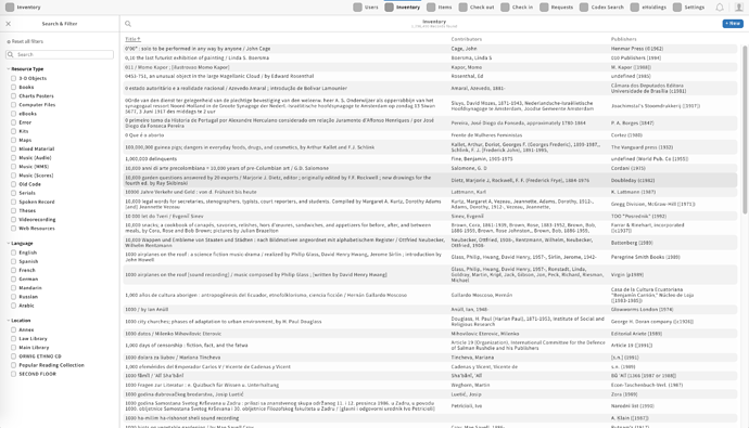
When selecting the Inventory app, a list of resource titles is presented in the 2nd pane. The idea is to show a list of resource titles to visually explain what the app does.

Question: Does this approach works as intended, or how would you like the landing page to look like?

2. The search box
Currently searching includes resource title, name of contributors, and identifier values

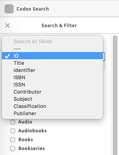
We envision to implement search using search criteria, implemented a dropdown menu, like what we have implemented in the Codex Search app

.

Please note, that we right now don’t have UX guidelines for advanced search in the Inventory app. This is something we can discuss further with Filip Jakobsen.

Question: What search criteria do you want to be searchable from the standard screen?

E.g.

  • ID - which is the system generated FOLIO ID number?
  • Identifiers as ISBN, ISSN, Coden … etc.
  • Title
  • Contributor
  • Subject Headings
  • Classification
  • Publisher
  • and others like: Call Number Range, Publication Year, Availability??

3. The filters:
Currently we have implemented: Resource Type, Language and Location

Question: What other filters would you like to have presented here in the Search and Filter pane?

4. General feedback
Please feel free to comment on any of the above questions, and also give us your general feed back on:

a) what do you like about the Inventory app (alpha version)?
b) what would you like us to do differently?
c) what is missing?
d) other suggestions?

Next steps:

  1. We’ll conduct a User Acceptance Test of the Inventory app in it’s current state (alpha) in February - date to be announced
  2. Follow up at the upcoming MM-SIG meetings and in other fora.
maura
5 Feb '18

I’m not an expert on UI, but I’ve heard staff complain about the interface to OLE, and I think I can provide a data point.

If we can make sure that we don’t rely too heavily on the mouse, that would be welcome. TS staff do a lot of repetitive tasks, and making them point and click every time is really annoying, according to complaints I’ve heard about OLE. I recommend being able to map a default search type to a function key, and have the ability to use the tab key and/or arrow keys to make changes where necessary.

Ann-Marie
5 Feb '18

Hi Charlotte,

Very quick take on everything. One solid question that came up at MM SIG and is worth making sure we understand. What is the value of starting with an inventory search instead of a codex search, especially since you can limit your codex search to inventory? Assuming we have a codex search, an inventory search, and a MARC-land search (where you can retrieve MARC records and edit them), it would be good to ensure that it’s very clear to the user visually which app they’re searching in.

In regards to your questions:

  1. Probably OK to land on a list of titles, as long as it loads quickly even if the library has millions of records. Might be good to include the format as a column, or else allow for the display columns to be customizable.

  2. Search list seems fine. Probably can collapse all numbers/identifiers into a single search for standard, maybe break out to more specific types of numbers in advanced. Would be good to have a Series Title search, unless that is lumped in with the plain Titles. Will there also just be a generic keyword search that searches all words, or will the user have to specify a particular type of search? And will FOLIO remember the last search type that I used? If I always search by identifiers, it would be nice not to have to click that into the search box each time.

  3. Might there be value in having filters that limit to all physical formats vs, all electronic formats? Might be less clicking for the user.

  4. If there are multiple inventories (multiple branch campuses having separate MARC databases, or consortial partners, or med school vs. main campus), would be good to be able to combine or limit based on those. That may or may not be the same thing as filtering by location, depending on how specific or broad the location filters are. For format, location, and language, would be good to be able to set defaults or have FOLIO remember my references - for example, I may almost always be searching music formats, or Arabic language materials, if I work with specialized materials. I wouldn’t have to work my way down from the general ocean to my specific tidepool each time.

  5. Once we get to UAT, it would be helpful to understand all the buttons/actions that might appear on an individual inventory record, e.g. order, view/create items, view/create holdings, edit MARC record, delete, copy, etc.

Hope that helps, plus gets more people talking! And like Maura said, having keyboard options and tools that decrease the number of clicks would be great.

A-M

Sebastian_Hammer
7 Feb '18

Hey Ann-Marie. I wonder if part of the answer is that it depends on the workflows, and not all libraries and librarians may choose the same starting point. It may be that there are cases where the ‘global’ view simply isn’t helpful because the results would be too noisy or because the library simply has chosen to manage one kind of resources in a different way.

That being said, I also don’t think that either of these apps have necessarily found their final form. I’d be interested in hearing the MM SIG’s opinion on this: Let’s say that we aspired to make the Codex search the right place to start for most things. What’s missing to make that a reality? We might think at it terms of search capabilities, but also in terms of what sort of integration with the other apps would be most helpful. The Codex search app is a new kind of beast… it was created knowing that we didn’t have a full picture of what was needed from it, in part so that experimentation might reveal how best to use it for different purposes.

Just my perspective, and maybe food for thought…

–Sebastian

fhemme
8 Feb '18

Hi @Charlotte_Whitt,
I have a more application-related question: we were talking about the possibility that there might be more than one inventory. If there are several inventories: can you see in the app which inventory you are currently searching in? Or do you only get this information in the metadata detail view in the field “metadata source”?

I’d also propose that we should use another delimiter for multiple contributors. A comma is currently used for this, but it is also used to distinguish between first and last name.

–Felix

Charlotte_Whitt
8 Feb '18

Hi @fhemme
The Inventory app, is ‘one’ local collection. Just like the eHoldings app, is the EBSCO KB. In the ‘Codex Search’ app then we eventually will have multiple knowledge bases (KBs) and multiple local inventories (Locals). It will be possible to search across all Inventories, or select a given Inventory, or select one or more specific Inventories. You’ll be able to see in the app which inventory you are currently searching in.
I’ll ask @Kimie_OuYang, who is UX lead on Codex Search to provide us with some UX sketches, to see how this can be done, and for us to discuss further in the MM-SIG and RM-SIG, if this works as intended.

Re:

I’d also propose that we should use another delimiter for multiple contributors. A comma is currently used for this, but it is also used to distinguish between first and last name.

I totally agree, and I have mentioned this for our developers. This is definitely up for change :slight_smile:

natascha
8 Feb '18

How would you like the landing page to look?

I agree with Ann-Marie that the display columns should be customizable. If that is not possible then at some point we will have discuss what info to display in these columns.

What search criteria do you want to be searchable from the standard screen? What other filters would you like to have presented in the Search and Filter pane?

I do like the option of being able to do a quick/basic search. Assuming that you can only search one field at a time in a basic search and that you would search multiple fields in an advanced search, there are certain fields that I might not even include in the basic search. In a basic search I would want the ability to search by title (maybe we would want to have a separate option to search by “journal title”?), contributor, identifiers like ISSN/ISBN, OCLC number, local bib number (I guess that is the FOLIO ID?), and possibly publisher (but if we are trying to keep the list short then publisher could probably be pushed into the advanced search). It would also be nice to be able to search for info that is contained in holdings or items like call number or barcode (not all of our holdings records have the same call number that is presented in the classification field). I would be much more likely to search for subject, availability, or publication year in an advanced search where I can search multiple fields. Alternatively: subject, availability, and publication range might be better used as filters than search options (at least on the basic search page). Do we want the basic search options list to be limited? Certainly if we don’t care then we could include all of those options in the list. I personally lean towards having the list be limited. I’m also wondering what the answer to Ann-Marie’s question is regarding generic keyword search?

LauraW
8 Feb '18
  1. I would prefer the landing page not show titles until a search is performed. Our catalog currently has over 6 million records and I imagine this creating potential performance issues. I also think it looks cluttered. I would prefer a generic heading such as “results” to indicate what will show up in the center pane once a search is performed.
  2. publication year and availability seem better suited as filters, not initial search criteria; call number range would be great
  3. Filters: publication year or even better publication date range; I love Ann-Marie’s suggestion of physical vs. electronic
ark316
13 Feb '18
  1. I think the list of resource titles does visually explain what the app does, but I think it would be more aesthetically pleasing and easier to read if there was a bit more white space, or if the font size was bigger (perhaps both).

  2. Identifiers, Title, Contributor, Subject Headings, definitely. Maybe availability would be more useful as a filter than as a search criteria.

  3. Perhaps in addition to Availability, we could include editions? Sometimes students ask for the latest edition of a title, so that might be helpful.

@fhemme and @Charlotte_Whitt, in terms of knowing what inventory you’re searching, I know all the KBs will have their own icon to the left of the title, but will each location within an institution will have their own icon as well?

fhemme
14 Feb '18

Hi @ark316 - having an edition filter would be useful, although I think that a filter works best with controlled vocabulary or unique codes. The edition statement in MARC 250 $a could include almost anything, e.g.
250 ##$a2nd ed.
250 ##$aSpecial education ed.
250 ##$aICPSR ed., OSIRIS IV version.
250 ##$aMedium-high voice ed.
250 ##$aRev. as of Jan. 1, 1958.
250 ##$aWorld’s classics ed., New ed., rev., reset, and illustrated.
250 ##$aThird edition.

ark316
14 Feb '18

Hi @fhemme. Do you think publication year would work better? I tend to shy away from using publication year because the list could end up being very long.

I’ve seen some discovery layers that have a scroll bar for the year of publication. That could get difficult to use if the range is too large. We could also have checkboxes with year ranges as a filter. I’m not sure what would work best.