Discuss.FOLIO.org is no longer used. This is a static snapshot of the website as of February 14, 2023.

:books: Filter layout for material types in Inventory

filipjakobsen
7 Jun '18

Hi everyone,

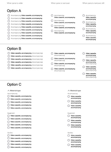
We have some very long, multi-level filters for material types in the filter pane in Inventory currently. In order to make sure the sort order and display of these are optimal, we need to decide how to display material types and their categories in the filter pane – here are 3 options. Option C could also contain checkboxes for each of the categories, which could serve to check of all the material types in that category.

Have a look and post your advice below — thank you!

LauraW
7 Jun '18

I much prefer Option C. It is cleaner and the hierarchical grouping makes sense to me. But I’d like to see how this might play out with other filter terms, e.g., resource and format types and even subjects. The solution and its logic should be something that will work for a variety of terms. (I am sure you have already thought about this, I would just like to see what you’re thinking.)

lmccoll_lyu
7 Jun '18

On the surface Option C is the most clear.

Is it beside the point to ask where the Material Type values will come from? I’m sorry if I’m behind on this discussion. If it is somewhere else on Discuss I can read about it. I’m trying to picture how those “larger” categories of “Accompanying” and “Equipment” will be derived as well as their subcategories. I’m only asking because picturing the output will help me understand what display works best.

LauraW
7 Jun '18

@lmccoll_lyu The material type values are a condensed list created from a dump of many libraries’ existing values, with those that really stood for loan types removed. Not a standardized vocabulary, but a large sample of realistic possible values.

See: https://docs.google.com/spreadsheets/d/1scRQl09jroOy-c_emITk3EQ6lkj7XPRlkupPNuL-FfM/edit#gid=435720102

lmccoll_lyu
7 Jun '18

Thank you. I’ll take a look.

Charlotte_Whitt
8 Jun '18

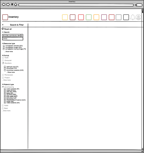
Hi @lmccoll_lyu and @LauraW - here an attempt to illustrate Option C with real data, from the spreadsheet the MM-SIG and RA-SIG has worked on: Resource_Format_MaterialType

There are some outstanding questions though:

When showing e.g. the first three of a category or from the list (like Resource type), should the terms then be in alphabetic order, or would we prefer to display as default the three most common ones, and then click on ‘… show more’ would bring up the full list, or the next 20 on the list etc. (right now Material type is 137 terms).

In my example here
a) I use three categories/terms, and then you can click ‘… show more’, but maybe it should be five - here @filipjakobsen can guide us.
b) I have introduced the possibility to ‘browse’ first the categories (relevant for Format and Material types), and then you can select a given category, and then drill down until you find the term you want to use as your filter selection - but this is just a suggestion

Lynn_W
8 Jun '18

I agree with Laura & Lisa - I like option C the best as well. I also like your suggestion to have a checkbox at the top (grouping) level that would allow selection of all items under that grouping.

LauraW
8 Jun '18

For filtering, I think showing the 3 most common is reasonable.

Lynn_W
8 Jun '18

HI Charlotte-

Good question! My gut reaction would be to have the list be sorted by frequency - most common category at the top down to the least frequent. But I could also see value in an alphabetical list.