Hello Everyone,
I just documented the pattern for the look-up feature and I would love to have your feedback.
The look-up feature allows users to easily search and pick content from a pre-configured list.
Structure
Look-up icon:
A look-up icon shall be placed on the right side of a text field allowing users to pick data from a pre-configured list.
If the text field allows free text entry in addition to the look-up feature, a vertical line shall separate the field from the icon.
Look-up modal:
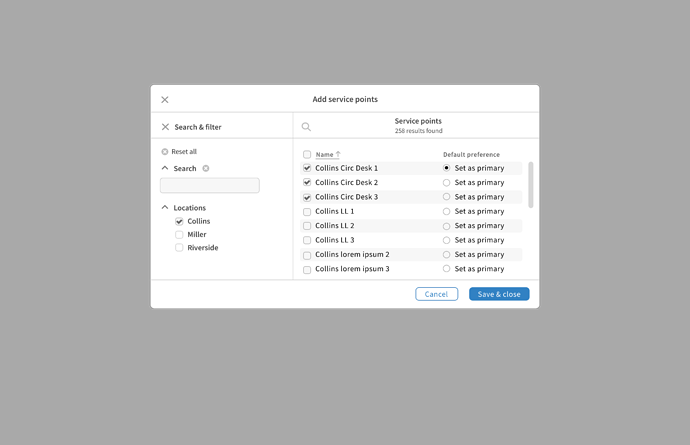
The look-up modal is composed of a header with a left close icon and a centred title.
The content is divided into two parts. On the left side, there is the search & filter and on the right side, there is the result list with checkboxes.
A “Cancel” button in the default style and a “Save & close” button in the primary style are placed at the lower right.
Behavior
When users click on the look-up icon, the modal appears.
Users can refine the result list by using filters or keywords.
Selected results have a checkmark so users know which result they picked.
Once the selection is done, users need to click on the “Save & close” button to add the selection.


