Every weekday I post a small Design Bite, covering a feature, question or topic for the Folio UX/UI. I encourage you to give constructive feedback on what I present, so we can adapt the system if necessary, to make sure it will work for you in practice 


 Today’s menu:
  Notifications in the UI
 Please note: This post is not about the technical term of notifications, which might cover much more than what is described here. This is merely covering what is considered a notification from a user’s perspective—UI notifications like we know them from mobile apps, desktop apps and social networking platforms.
The current thought of notifications in Folio is to provide the user with a unified notifications view like we know it from mobile and desktop operating systems as well as social networking platforms. Through this unified view, the user will be able to view all notifications from the system, or to filter notifications based on which app provided them.
##3 Levels of notifications 


The system would support a few different levels of UI notifications out of the box:
- Basic notification—the type that appears in the unified popover for notifications (aka the notifications center)
- Toast notifications—which will appear in addition to the basic notification, for urgent or very important notifications
- External notifications—to begin with, email, but in the long run, potentially any kind of external messaging service (SMS, Slack, phone calls, etc.—this overlaps with the topics of integrations with external platforms as well as automation, both of which I will cover in other Design Bite posts at another time.
##1. Basic notifications 
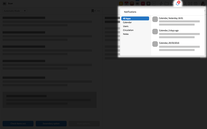
Basic notifications—wireframe
In the notification center, the amount of unseen notifications would be indicated with a small badge containing the amount of unseen notifications for all apps. Opening up the popover would also allow the user to see how many unseen notifications exist for each of the apps.
##2. Toast notifications 


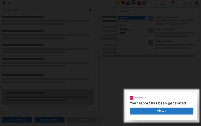
Toast notifications—wireframe
Toast notifications are useful for apps that provide a type of notifications that require immediate attention. They appear as a small box containing a message, on top of the page you have open at a given time, and provides a shortcut to the app in question to the user. The user can also close the notification if it gets in the way of something they are doing at that moment. If nothing is done from the user’s side, the notification disappears after a few seconds. All notifications that appear as toasts, must also appear in the general notification center for later access—if the user missed the toast or wishes to view the message again a little later.
##3. External notifications 

External notifications might be set up to communicate with the user’s email address and would be controlled by the user on a per-app basis. (See more below)
##Notification Preferences
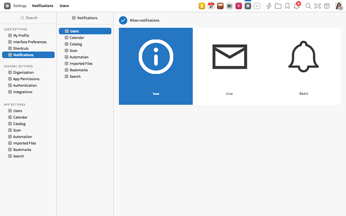
Notification preferences wireframe
For each app, the user would be able to change the notification preferences—whether to receive notifications at all, and in which format. This setting would be reachable from the settings menu for the individual apps as well as a unified Notifications Settings view.
##Do not disturb schedule 

In the future we might also think about creating a do-not-disturb schedule (like we know it from e.g. Slack) depending on the user’s working hours and time zone, but as we are thinking about notifications currently for the first version, this is not something we are prioritizing.
Are we missing something? Comment here and let us know!—Your feedback is essential to make sure we build a system that works in practice and not just in theory  !
!


