Discuss.FOLIO.org is no longer used. This is a static snapshot of the website as of February 14, 2023.

:bulb: UX exploration: Pattern - Edit record, new pattern suggestion

Stephanie
23 Jul '18

Hello Everyone,

I just documented a new pattern idea to edit a record and I would love to have your feedback.

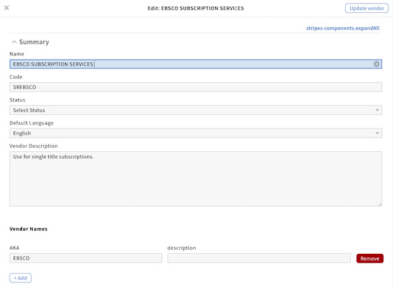
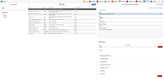
When users click on the record pane edit icon, the pane shall be editable (instead of having a full-screen edit record page).

Structure
The edit pane header shall have a close icon on the left, a “Update {app name} button on the right and a centred title with the following format: Edit {record name}. Also, the content layout shall be similar to the selected record with editable text fields.
37%20AM

Behavior
Users might be able to add text fields by clicking on the “+ Add {category name}” button in the default style.
They shall also be able to delete a field by clicking on the red “Remove” button next to it.
When users click on the “Update {app name} button, changes are saved and the pane comes back to its original noneditable state.

fhemme
26 Jul '18

Hi @Stephanie,
in principle this looks useful. I am concerned that there may be some issues on low-resolution or strange format displays/devices if input masks with many wide fields are to be displayed.

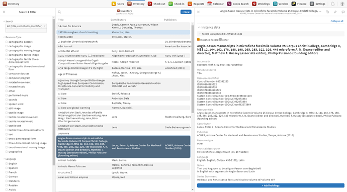
It looks like you are working with a high-res display (2424x1176 px), therefore you shouldn’t experience any issues. I’m using a 1080p full hd display and in the inventory app the “edit directly in third pane” could be quite challenging:

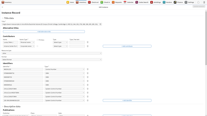
Especially when you compare it with the current edit screen, where almost 3/4 of the screen is used:

Just my 2 cents :slight_smile: --Felix

Stephanie
6 Aug '18

Thank you for your feedback, Felix! @kevinhorek, do you have any comments/thoughts on this?