

Since the inception of the visual language and UI framework for FOLIO, we have been wanting to build FOLIO as a system for the present and the future. That means supporting usage with various input devices, on various device and screen sizes, browser window sizes and browser zoom levels.
Library software contains a lot of data. And a lot of tables. Tables are inherently hard to scale down if one wants to maintain their large-size layout. However we believe it is important to be able to intuitively access the data in the FOLIO system no matter what size device, browser window or browser zoom level you use. The solution is the “reflow” the content in the table to be optimal and intuitive to use on a narrower layout.
We are nearing the point in time when we will want to support this “responsiveness” in tables, and we have looked into a few different patterns we could use.
They are attached here below as animated GIFs. Have a look and share your thoughts, ideas and advice about which of these patterns might be preferable for your workflows in general, or for certain workflows:
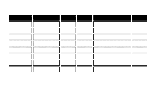
Exploration 1 
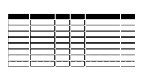
Exploration 2

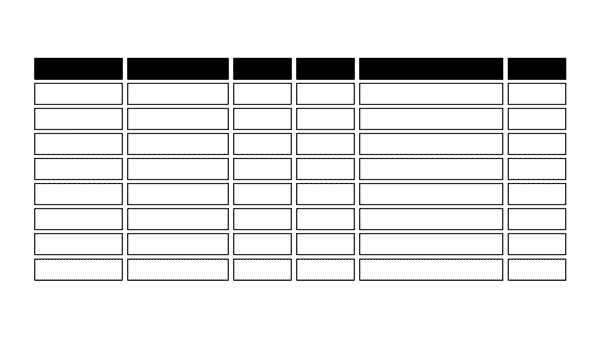
Exploration 3
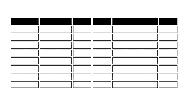
Exploration 4
Exploration 5
Animations by Benny Aarup

